
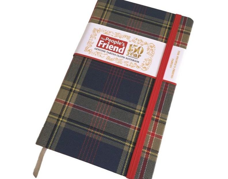
The Tartan Notebook
This is a story that begins back in 2008.
Members of the “Friend” editorial team and the Promotions Department met Brian Wilton of the Scottish Tartans Authority to discuss creating a special tartan design for the magazine.
Brian worked wonders with all the information we gave him, and came up with a beautiful red- and blue-toned tartan that symbolically tells the story of 150 years of the “Friend”.
Although we didn’t have the right project for it at the time, we’re delighted to be unveiling it now – woven and used to cover this gorgeous hard-backed notebook.
What Do The Colours Mean?
- The bright azure blue reflects the sunny blue skies of J. Campbell Kerr’s distinctive watercolour cover paintings, while the bold red stripe outlined by white represents the magazine’s instantly recognisable masthead.
- The grey is a tribute to the city of Dundee, home of the “Friend” on the northern banks of the silvery Tay.
- The five pink lines celebrate the five continents of the globe where the “Friend” is enjoyed every week, and the 16 small squares they form fondly recall the number of pages in the magazine’s very first issue.
- The single black line represents the type in each and every issue.
- Yellow is the colour of friendship, a quality valued dearly by the magazine’s readers, who regard the “Friend” itself as just that.
The Notebook
Made exclusively for us by Waverley Books, it’s available to buy only from the D.C. Thomson Shop.