
In the Pink for Your Home
What better way to celebrate the month of love than with a pink bathroom!
As February closes we can’t help but daydream a little further with this gorgeous design for a pink bathrooms. Pink is such a soft colour yet still a bold choice to decorate with. Yet Pink has a fascinating design history as we discover…
The colour Pink always has such positive associations, ‘In the pink’ and ‘Everything is rosy’ are phrases we associate with good luck. However, we are still reticent about it as a design choice.
Could these bathrooms be the difference in design? Our own design team has positive thoughts about pink too when choosing colour palettes for the “Friend” pages. Jaclyn says “I like to use the colour pink when designing pages that require a feminine touch. Light pinks, in particular, can give a feeling of peace and serenity and depending on the mood and feel of the layout, pink can also convey tenderness and romance – so is great for romantic fiction. It’s such a versatile colour!”
Do you like the friend illustrations? You’ll often find them on the daily serials online.
A History of Pink.
According to this article by Business Insider, Pink and Blue were once typical colours for boys and girls. Although, not in the way we associate them now.
“In the early part of the 20th Century and the late part of the 19th Century, in particular, there were regular comments advising mothers that if you want your boy to grow up masculine, dress him in a masculine colour like pink and if you want your girl to grow up feminine dress her in a feminine colour like blue.”
“This was advice that was very widely dispensed with and there were some reasons for this. Blue in parts of Europe, at least, had long been associated as a feminine colour because of the supposed colour of the Virgin Mary’s outfit.”
“Pink was seen as a kind of boyish version of the masculine colour red. So it gradually started to change however in the mid-20th Century and eventually by about 1950, there was a huge advertising campaign by several advertising agencies pushing pink as an exclusively feminine colour and the change came very quickly at that point.”
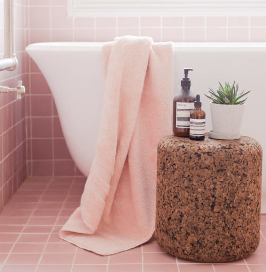
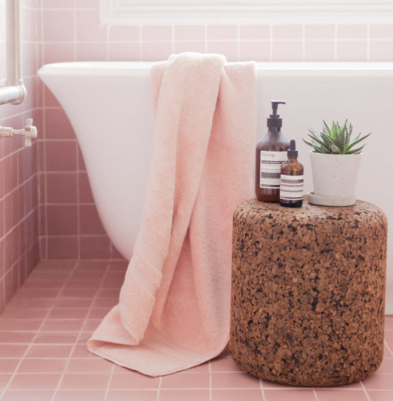
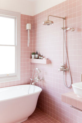
Peace and tranquility
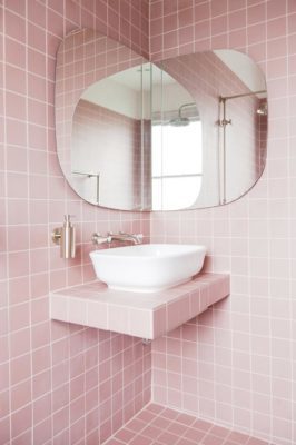
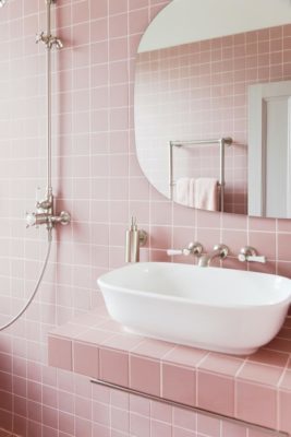
So, while the evenings are finally getting lighter, perhaps so are our interiors! We’re ready to skip into Spring with an array of pastel hues. Calm and relaxing, these sophisticated palettes add style and light to any home. Tile Giant’s collaboration with interior designers, 2LG Studio has definitely given us food for thought.
Pink promotes tranquility, and there’s no better way to unwind from a stressful week than to soak in a hot bath and read a good book. (Shirley can give you lots of pointers for books in her weekly book reviews.)
Clean lines, a sculptural bath and some classic fixtures create a modern take on a Victorian classic. These porcelain Victorian Pink tiles give a beautiful contemporary feel but at the same time creating an authentic connection to a bygone era.
Bliss! Just don’t forget your bath caddy!
Feeling rested after all this pink? Make sure you are getting a good night’s sleep with these tips.