
Lyle’s Golden Syrup Logo Rebrand After 150 Years

Lyle’s Golden Syrup has modernised its logo and packaging design after having remained unchanged for over a century
It’s the rebrand we weren’t expecting. Lyle’s Golden Syrup holds the Guinness World Record for the world’s oldest unchanged brand packaging, which is pretty amazing.
The brand has maintained the same logo since 1888, when the image of a dead lion surrounded by a swarm of bees was first introduced. This week the logo was replaced with a lion’s head and a single bee – both are a wonderful golden syrupy-shape.
Tate & Lyle Sugars says this move is an effort to appeal to modern shoppers. The rebrand will begin this month and continue throughout the year across the company’s full range of products.
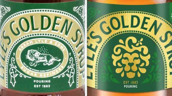
The old logo: a dead lion surrounded by a swarm of bees. The new logo: a lion’s head and a single bee.
Lyle had strong religious views. When creating the original branding, he drew inspiration from the bible. In particular, the story of Samson from the Old Testament. Samson kills an attacking lion and later a swarm of bees forms honeycomb within the lion carcass. Hence, the brand’s logo and accompanying tagline “out of the strong came forth sweetness.”
You will all fondly remember the Victorian-style tins! These have been fully replaced with the squeezy plastic bottles used elsewhere in the range.
This is the first time since World War I that the metal tin is being ditched. During the war, all available metal was sent to the front lines. Therefore, in 1914 the company replaced their sturdy tin with cardboard packaging which included a message of explanation.
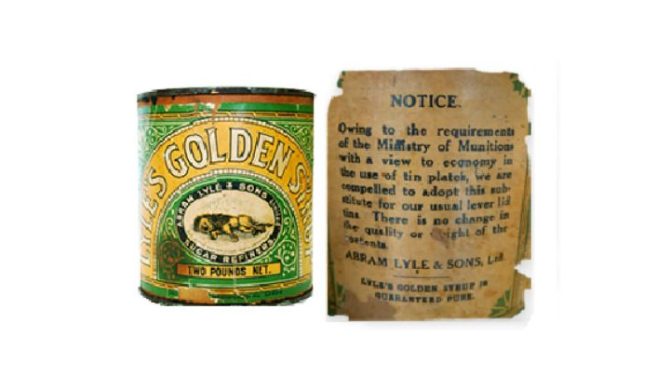
Lyle’s Golden Syrup cardboard packaging from 1914, due to metal resource restrictions during WWI
The company’s brand director James Whiteley said in a statement: “Our fresh, contemporary design brings Lyle’s into the modern day, appealing to the everyday British household while still feeling nostalgic and authentically Lyle’s.”
Helen Edwards, adjunct associate professor of marketing at London Business School spoke exclusively to the BBC. She said that the rebrand would reduce the risk of excluding new potential buyers.
“The story of it coming from religious belief could put the brand in an exclusionary space, especially if it was to go viral on X or TikTok,” she said.
“But hanging on to some of the original branding is a good idea as people tend to remember brands through visual codes – the green colour, the lion – which remind people ‘that’s the product I buy, that’s the one I like.'”
Did you know?
Captain Scott took a tin of Lyle’s Golden Syrup with him on his ill-fated Antarctic expedition in 1910 – and it survived! When Scott’s stores were rediscovered by explorers in 1956, the Victorian-style tin was intact and the syrup inside still good.
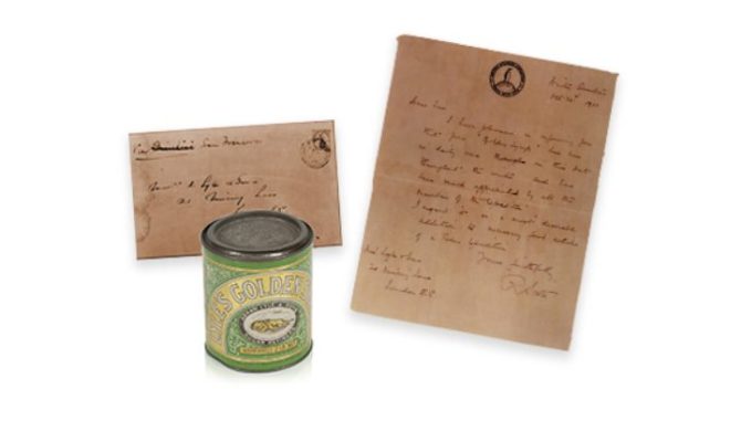
Captain Scott’s recovered tin and letter of thanks. Credit: Lyle’s Golden Syrup.