
The Marvel Of Maps
I remember poring over our household Atlas when I was a child. It was a big book, with info on the heights of the mountains, and the depths of the ocean. It had that wonderful green to purple/white gradation in colour that indicated height, too.
I wondered what life was like in Glasgow, Montana or in Fiji or Patagonia – and how people ended up in these far-flung places.
Maps and atlases reveal so much of what we did and didn’t know about the world in our past. Even poking through old Ordnance Survey maps at an antiques centre just down the road from us reveals railways that now lie lost in the woods, hamlets that have become towns, and towns that were once major hubs bypassed by main roads and now quiet and stuck in time.
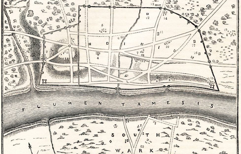
The main image on this blog is of the original Roman fortification of Londinium. It’s staggering to see how small it was. A big fort to them, no doubt, but nothing like heaving city it now is.
Growing Knowledge
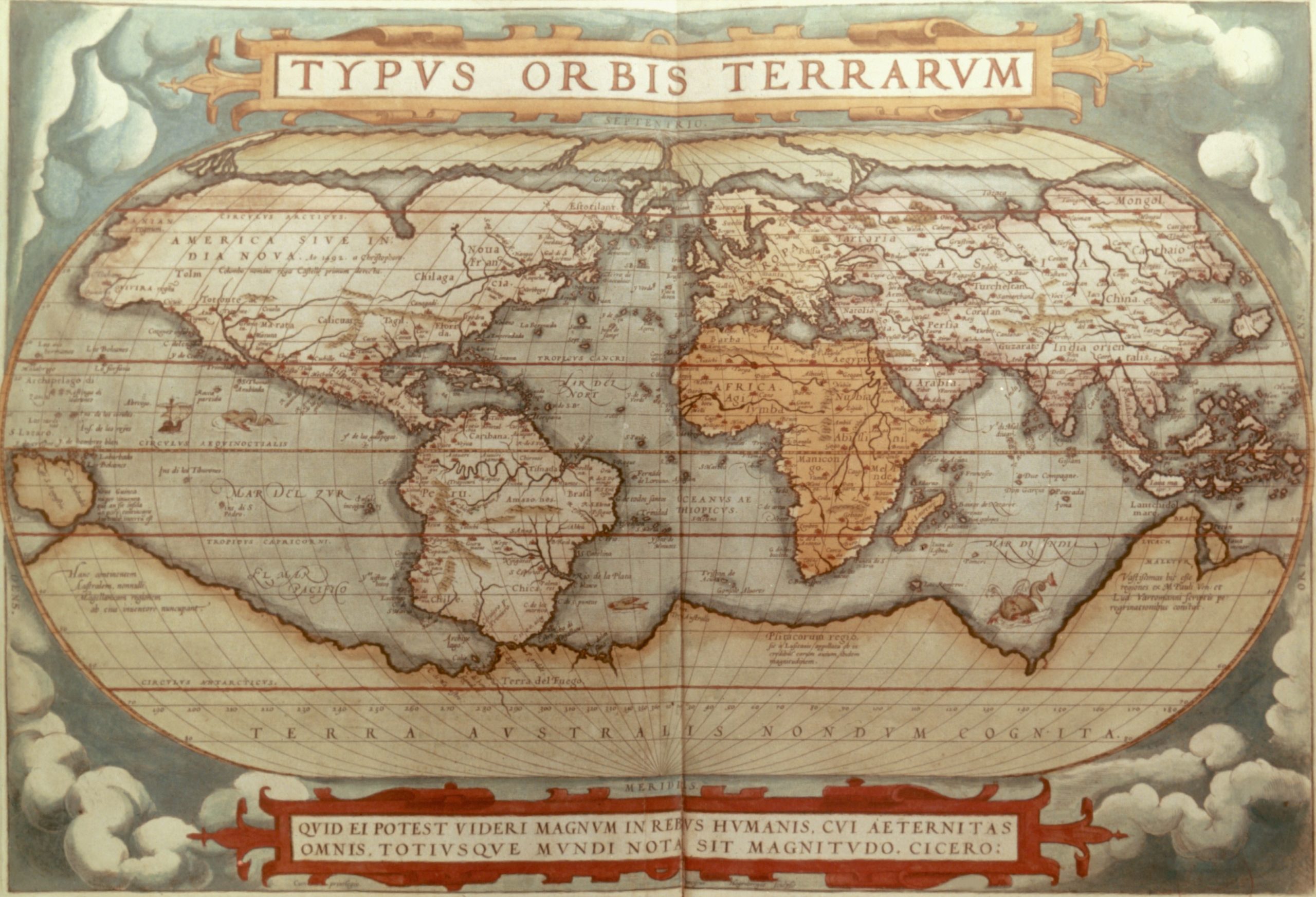
Photo by Granger/Shutterstock.
This was the world as cartographers saw it in 1570 – not a million miles away from its true form. It’s so revealing!
It seems all they really knew about North America was that it was really, really wide! And South America barely resembles much more than Brazil by itself. Europe is, of course, fairly well-known – but it almost seems like Africa was the most familiar continent. Perhaps a testament to its crucial role at the centre of various trades – some good, some bad.
And all they knew about Antarctica was its scale. It’s given name on the map roughly translates to “the southern land not yet known”. The south bit is “Australis”; Australia itself may be that distinct lump of an island on the far lower left.
There are some of the obligatory sea monsters lurking around in the Pacific and Indian Oceans!
A Hundred Years In The Making

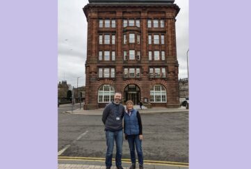
Andrew Redmond Barr.
In this week’s issue, writer and artist Andrew Redmond Barr chats to Dawn Geddes about his project to produce the first hand-drawn map of Scotland in 100 years.
Much like the sea monsters and illustrations of historic maps, his plan is to include details of the country’s history, economy and culture into the map in a way that no modern satellite image can.
In Andrew’s map, he’ll do this in a number of ways, including drawing attention to small places that have had a disproportionate impact on Scotland:
“I think a good example of this is the small East Lothian village called Athelstaneford.
“According to legend, it’s the place where the symbol of the Saltire appeared above a battlefield.
“It was after that that the Saltire was adopted as Scotland’s national flag.”
Andrew believes that “flagging” these things up on the map will help people from Scotland and beyond better understand the cultural geography of the country.
Andrew crowd-funded his project, and he has surpassed his target. And I, for one, can’t wait to see what this new map will reveal about the nature of one of the world’s oldest nations.
Never miss an issue again with a subscription to “The People’s Friend”.